How to Optimize User Interface and Usability in Web Guiding Equipment
The user interface (UI) and usability of web guiding equipment are critical factors in ensuring efficient and accurate operations in various industries. This article explores the importance of user interface and usability in web guiding equipment, highlighting key design principles and best practices.
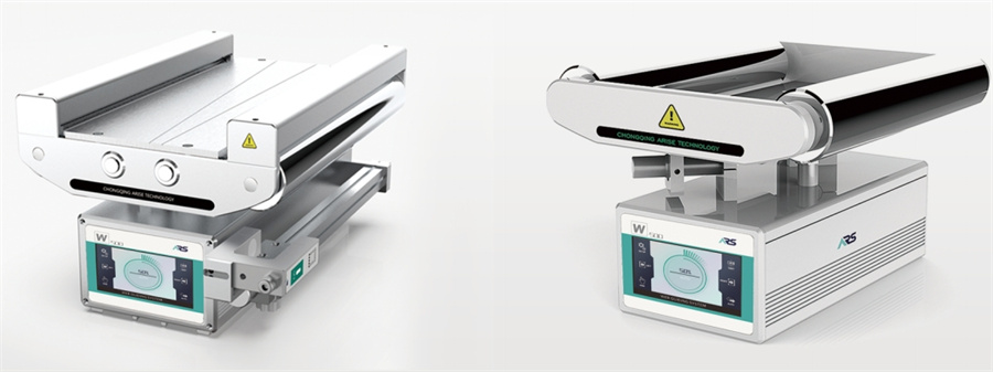
Importance of User Interface and Usability in Web Guiding Equipment
| Aspect | Description |
| Operational Efficiency | A user-friendly interface streamlines operations, reducing the time and effort required to perform tasks. |
| Error Reduction | Intuitive designs minimize user errors, ensuring more accurate and consistent operation. |
| User Satisfaction | Enhanced usability leads to greater user satisfaction and confidence in using the equipment. |
| Training and Adoption | Easier-to-use systems require less training, facilitating quicker adoption and proficiency among operators. |
| Safety | Clear and accessible interfaces improve safety by preventing misuse and ensuring critical controls are easily reachable. |
| Productivity | Efficient interfaces boost productivity by enabling faster task completion and reducing downtime. |
| Maintenance and Troubleshooting | Simplified interfaces make maintenance and troubleshooting of web guide system more straightforward, minimizing operational disruptions. |
| Flexibility and Adaptability | Usable systems can be easily adapted to different users and changing operational needs, ensuring long-term viability. |
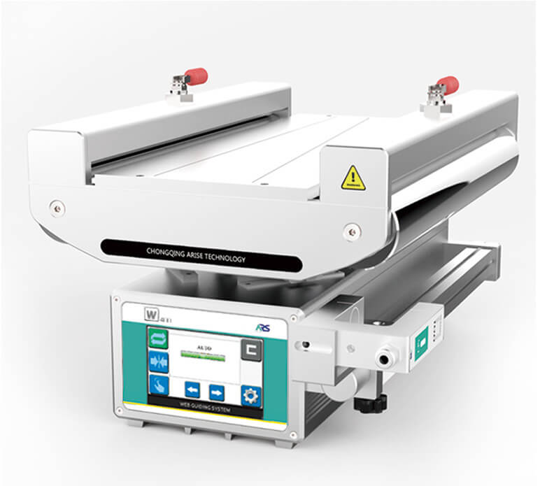
Key Design Principles for User Interface in Web Guiding Equipment
The user interface of web guiding equipment is a critical factor that determines the ease of use, efficiency, and overall user experience.
1. Simplicity and Clarity
Intuitive Navigation
The user interface should have a clear and straightforward navigation structure. Users should be able to find and access functions easily without having to go through multiple steps.
Minimalism
Avoid clutter by including only essential elements on each screen. Overloading the interface with too many options can confuse the operator.
Clear Labels
Use clear, concise labels for buttons and controls. Ambiguous terms can lead to misunderstandings and operational errors.
2. Consistency
Uniform Layouts
Maintain a consistent layout across different screens and functions. This helps users predict where to find certain controls or information, reducing the learning curve.
Standard Controls
Use standard control elements like buttons, sliders, and icons consistently throughout the interface. Familiar controls make the system easier to use.
3. Feedback and Responsiveness
Real-Time Feedback
Provide immediate feedback for user actions. For instance, if an operator adjusts a setting, the system should reflect the change instantly.
Status Indicators
Use visual indicators (such as color changes, progress bars, or icons) to show the status of operations and any errors or warnings. This helps operators quickly assess the system’s condition.
4. Accessibility
Easy-to-Read Fonts
Choose fonts that are legible and of appropriate size to ensure readability from a distance. Avoid overly stylized fonts that can be difficult to read.
Contrast and Color Use
Ensure there is sufficient contrast between text and background colors. Use color coding judiciously to convey information, but be mindful of color blindness.
5. Customization and Flexibility
Adaptable Interfaces
Allow users to customize the interface to suit their preferences or the specific requirements of different tasks. This can include adjusting the layout, changing color schemes, or configuring shortcuts.
Scalable Design
Design the UI to be scalable so it can adapt to different screen sizes and resolutions, ensuring a consistent experience across various devices.
6. Safety and Error Prevention
Error Prevention
Implement features that prevent errors, such as confirmation prompts for critical actions and input validation to avoid invalid entries.
Emergency Controls
Include easily accessible emergency stop buttons and clear instructions for handling emergency situations. These controls should be prominently placed and clearly labeled.
7. Training and Support
Integrated Help
Incorporate help guides and tooltips within the UI to assist users in understanding functions and troubleshooting issues.
Training Modes
Provide a training mode that allows new users to learn the system without affecting actual operations. Simulated environments can help in building confidence and competence.
8. Performance and Efficiency
Optimized Workflows
Design workflows within the UI to minimize the number of steps required to complete common tasks. Efficiency in navigation and operation boosts overall productivity.
Loading Times
Ensure that the UI is responsive with minimal loading times. Slow interfaces can frustrate users and hinder productivity.
9. Feedback Collection and Iteration
User Feedback
Regularly collect feedback from operators to understand their pain points and areas for improvement. This feedback can guide updates and enhancements to the UI.
Continuous Improvement
Iteratively refine the user interface based on user feedback and technological advancements. Regular updates can address emerging needs and incorporate new features that enhance usability.
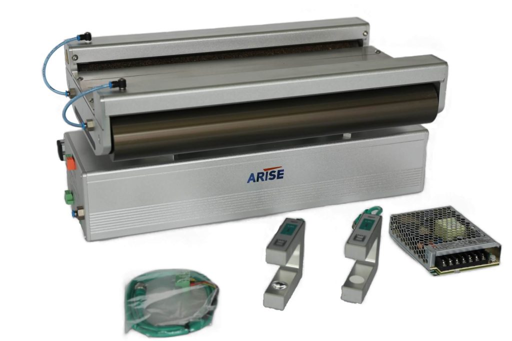
Best Practices for Usability in Web Guiding Equipment
1. User-Centered Design
Understand User Needs
Conduct user research to understand the needs, skills, and limitations of the operators. This ensures the design is tailored to their requirements.
Personas and Scenarios
Develop user personas and scenarios to guide design decisions and ensure the system meets real-world use cases.
2. Intuitive User Interface
Clear Navigation
Design an intuitive navigation structure that allows users to find information and controls quickly. Use menus, tabs, and breadcrumb trails effectively.
Consistent Layout
Maintain a consistent layout across all screens to help users learn and predict interface behavior.
3. Effective Feedback Mechanisms
Immediate Feedback
Provide real-time feedback for user actions, such as visual or auditory signals when a button is pressed or a setting is adjusted.
Error Messages
Design clear and helpful error messages that guide users on how to correct mistakes.
4. Accessibility and Ergonomics
Readable Fonts and Colors
Use large, legible fonts and high-contrast color schemes to enhance readability, especially in different lighting conditions.
Ergonomic Controls
Place controls and inputs within easy reach and ensure they require minimal physical effort to operate.
5. Customization and Personalization
Adjustable Settings
Allow users to customize interface elements for web guiding system, such as font size, color themes, and layout preferences, to suit their individual needs.
User Profiles
Implement user profiles that save individual settings and preferences for a personalized experience.
6. Streamlined Workflows
Task Automation
Automate repetitive tasks to reduce user workload and minimize the risk of errors.
Guided Processes
Provide step-by-step guidance for complex tasks to ensure they are completed correctly and efficiently.
7. Safety and Security
Error Prevention
Design features to prevent common errors, such as confirmation prompts for critical actions and input validation to avoid incorrect entries.
Emergency Controls
Ensure that emergency stop buttons and safety controls are prominently placed and easily accessible.
8. Training and Support
Integrated Help
Include contextual help and tooltips within the interface to assist users in understanding features and troubleshooting issues.
Training Resources
Provide comprehensive training materials, such as manuals, videos, and interactive tutorials, to help users become proficient with the equipment.
9. Performance Optimization
Responsive Design
Ensure the interface is responsive and performs well under various conditions. Slow response times can frustrate users and hinder productivity.
Efficient Workflows
Optimize workflows to minimize the number of steps required to complete tasks, enhancing overall efficiency.
10. Continuous Improvement
User Feedback
Regularly gather feedback from users to identify pain points and areas for improvement.
Iterative Design
Implement a process of continuous iteration and improvement based on user feedback and technological advancements.
Practical Implementation Steps
| Step | Description |
| Conduct Usability Testing | Perform regular usability testing with actual users to identify issues and gather insights for improvement. |
| Develop a Usability Checklist | Create a checklist of usability best practices to ensure all design elements meet these standards before implementation. |
| Incorporate User Training Sessions | Provide initial and ongoing training sessions to ensure users are comfortable and proficient with the system. |
| Implement Feedback Loops | Set up mechanisms for users to easily provide feedback and ensure this feedback is acted upon promptly. |
| Regular Updates and Maintenance | Keep the system updated with the latest features and security patches, and regularly maintain the interface of the web guide system machine for optimal performance. |
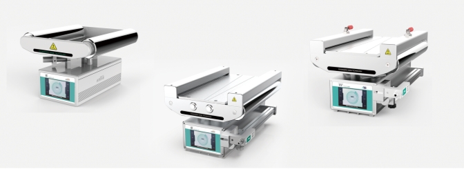
Conclusion
The user interface and usability of web guiding equipment are pivotal in ensuring effective and safe operations. Through focus on the principles of clarity, simplicity, consistency, feedback, responsiveness, and accessibility,manufacturers can develop user-friendly web guide systems that enhance operator performance and reduce errors. Implementing best practices such as user-centered design, comprehensive training, regular updates, customization and ongoing testing ensures that web guiding control systems remain efficient, reliable, and adaptable to various industrial applications.
